
Towards Arena oils on wood panel 37cm x 22cm

East Towards North Street, oil on canvas, 50cm x 30 cm


Bridge Shadow south east oils on board 40cm x 30cm


Bridge installation 70cm x 12 cm acrylics on card

Bridge Installation acrylics on cartridge paper

Bridge Installation acrylics on glass panels

Paper collage of cut up photocopies A3

South West gouache on paper A4

North West acrylics on paper 50cm x 32cm
South West watercolours A3

Bridge Shadow fineline drawing A4

South West monoprint A4

Bridge Shadow monoprint on watercolour paper A3
So welcome to Bridge Studies - the lonely city... evolving into the empty city. The following images are scanned-in pages from my practice journal, pre-coronavirus lockdown...


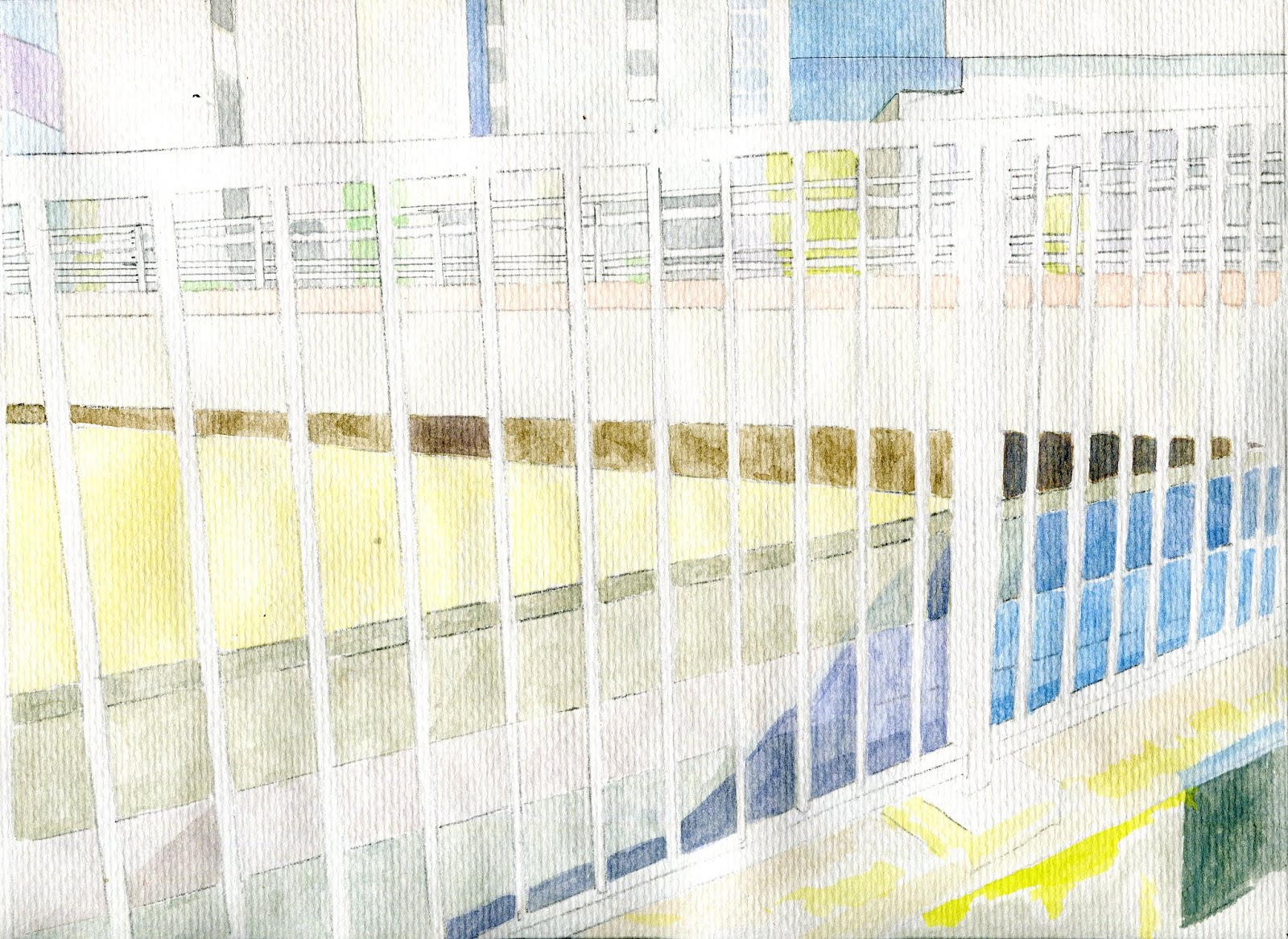
Saturday 21/03 Sketch 1 - A3 size ready for colour - going for an abstract painting

Sketch 2 (hard to see!) This is from the opposite side of road - A2 size - will paint in colour, but probably after sketch to to rectify any colour issues raised from sketch 1

Couldn't help but see parallels between the angles and geometry from my bridge studies and the drama of empty supermarket shelves - may explore the link between emptiness on the streets and emptiness on the shelves to contextualise my work within the current social situation of coronavirus isolation.


Next steps: 1. add colour to the railings 2) scan painting and print copies to explore line work on top of the image
Next Painting: will use a different, less representational combination of colours but still conform with colour theory. Next painting I'll use acrylics, work a bit larger.
 So, I'm quite pleased with the painting so I've scanned and printed it out so I can add various layers eg fineliner, conte, pencil, white gel pen.
For the larger experiment I've selected a different triadic combo and I'll be working in acrylic - making a start today (25/3)

This painting is larger (A2) and I'm going to track it with bits missing (this was a feature Adam thought worth pursuing) I'll complete it because I want to see what the railings look like in red. From here I could develop this as a more abstract piece focusing on the negative spaces. I certainly want to explore using layers - with glass, tracing paper, acetate - and photos that I have on acetate.
Introduced more colour using tetradic combo.

Plan is to complete this as an exercise and then produce paintings that a) focus on details b) leave details out.
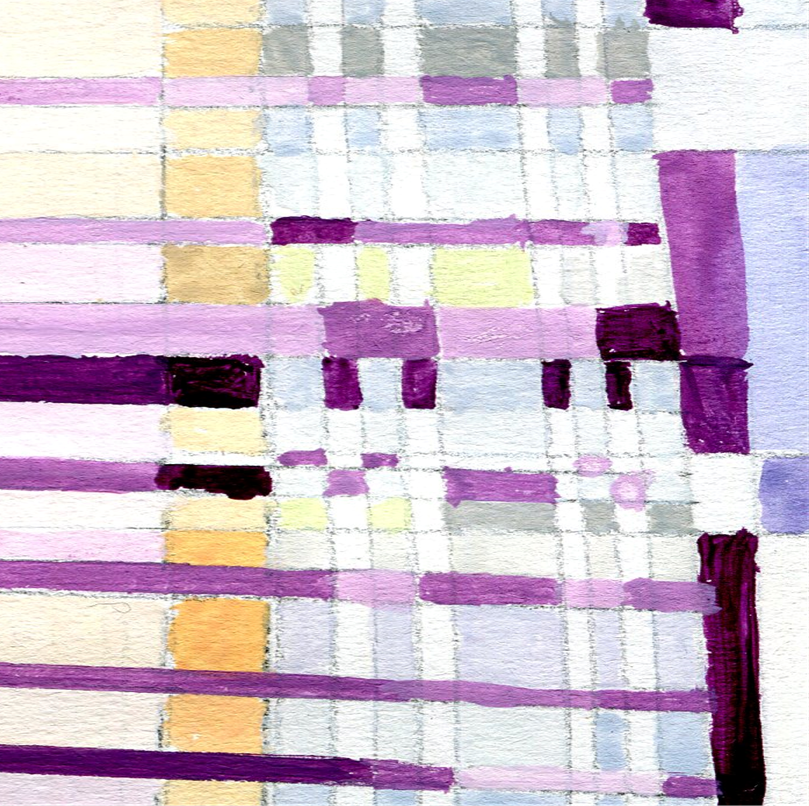
Zooming in and cropping is quite effective:


Research:

Still using a physical practice journal for sketches and thumbnails. Beginning to explore paring right back the detail from my paintings:

Research:

These are from different perspectives and I'm considering working back to small and possibly primary colours only to produce a series of pieces. Maybe use stencil made from tape and then apply acrylic using palette knife to achieve a smoothness.
Progress on the larger painting - I will complete it, including the railings, as an exercise and then work backwards by removing detail / zooming in on areas.

It's completed. Now going to play with the image ie zooming in, printouts with drawing on top. yES, IT'S A BIT BUSY but I wanted to get it finished using the tetradic colours I'd selected. Certainly, if I'm going to progress with this I think I want to focus on details or remove bits - reduce it down. I've prepared 4 smallish pieces of board in very matt white - using a dry brush to reduce brush strokes so my next step is to select shapes from the originals to produce abstracted and significantly more minimal images, probably in primary colours to make the simplicity of the image more consistent. It is also running along a concept more to do with "empty" city, rather than "lonely" city to reflect the very unique times we're all living in, and only imagining the empty streets - my walking route - in Leeds.

Examples of zoomed-in details from this painting which I might play with:


and put these images next to each other, somehow. Also, I'm researching painting /scratching / drawing onto glass using special pencils (stabilo woodies) and acrylic paint.
Tuesday 31st
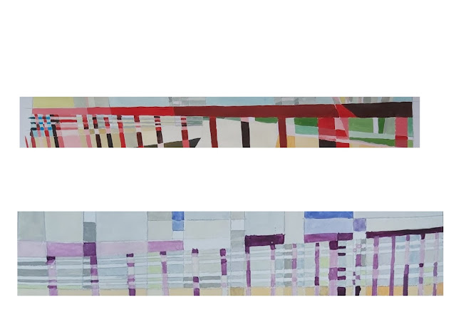
As an artistic workout, started the day having a play with the 2 paintings - cutting out horizontal strips then reassembling - I'm a bit charmed by the effect - looks like an embroidery or textiles design:


Zoomed-in crop has an unexpected concertina effect
When assembling I adhered to "rules" ie alternating between the 2 paintings but the selection of strips was fairly arbitrary. Looks a bit like code and I can see image-themes running consistently like a weave. I could pursue this BUT TODAY I want to throw myself into the opposite extreme by going more minimal. also, want to experiment with drawing onto glass:


Continuing with colour and repeated lines on the vertical, diagonal and horizontal - but less precise and more gestural - some very interesting lines occur. I would like to add layers of glass with different perspectives of the bridge (this is a perspective I haven't yet drawn ) It's been refreshing to explore the geometry of the bridge with less precision.

Positioned the glass panel in front of a black board and there's much I'm liking about this: a) a composition which has been confounding me is beginning to materialise b) the flexibility of the stabilo woody crayons is impressive - the colours are chalky and not too vibrant and it'll be possible to carve into blocks of colour c) working with lines in this more unconstrained way brings energy which has been a bit lacking in the paintings d) I've been able to incorporate several perspectives of railings.
Ways forward:
- remove bits to return to the idea of something more abstract and minimal
- consider layering drawings with the other panels
- vary lines to create better depth
- introduce patches of acrylic - scratch into ii
Abstract experimentation.
What I wanted to achieve was blocks of smooth thick colour using stencils with paper and masking tape. It was tricky - the results were unpolished but I just need better control and practice:

I used a palette knife to achieve a really smooth surface of colour - that bit worked well. Alternative approaches could be to cut out the shapes on painted card but that would prove irksome when working with tiny shapes, I think. Anyway, I've painted some card and that's the next task.
Cutting out the painted card worked better than expected and the colour is smooth an even. Arranged pieces in accordance with the original painting - not stuck down because want to add / remove / additional primary colours and black:
 Friday 3rd April
Going to explore how these images work on glass - with / without lines, in primary colours. Also interested in exploring the detail from the paintings - maybe in the actual colours of the paintings, but might use a different combination - using colour theory, of course!

 I've pulled together the progress I've made painting onto glass:

Here's how the layers of glass and paper work when photographed in different situations:Cutting out the painted card worked better than expected and the colour is smooth an even. Arranged pieces in accordance with the original painting - not stuck down because want to add / remove / additional primary colours and black:

Going to explore how these images work on glass - with / without lines, in primary colours. Also interested in exploring the detail from the paintings - maybe in the actual colours of the paintings, but might use a different combination - using colour theory, of course!


Next steps with this strand of work are:
- produce more layers with the pieces breaking away from the lines of geometry by cutting out the shapes and dropping them onto the glass and recording through photography how they fall
- focus more on the spaces created by the lines rather than the shapes
- explore how to display the slides
The painting strand: using oil paints. To explore oils - a medium I have VERY LIMITED experience using but have a real hunger to get going with them - I've taken a detail from the first gouache painting, drawn it onto painted particle board and enlarged it to 72cm x 32cm. I painted the board pink to provide a surface which might peep through. I've chosen triadic colours: violet / yellow-green / yellow-orange, which is slightly different to previous:

It has been a bit more effort using the oils and making sense of how to use medium but I like the richness of the colour that I'm achieving.
Update on the painting:

Update on the painting:

Although it's bigger than previous paintings, it's in oils and it represents a detail from the previous work I don't think this painting necessarily offers anything new. Just need to add the shades of violet to the remaining pink - might be better to make a judgement once its completed.

I like the way the horizontal and horizontal bars look like they've become woven. Also, the forms dissolve in places. Using the split complementary colours also ensured that the composition wasn't too busy and chaotic.
Using oils has been a revelation and I'm itching to do another painting, maybe using more gestural brushwork. Mixing colours felt really quick and the paint went a long way. Doing this painting helped me to start learning how to use medium, using different brushes and the behaviour of the paint on the surface - in this case it was particleboard.
The next painting will be smaller versions on a square canvas - I haven't yet decided whether the application of colour will a) correspond directly with the original paintings or whether to continue exploring new colour combinations (likely as this is all experiementation - what's the point in staying with the same colours - next version should develop on) and b) experiment with use of brush strokes - be more abstract / gestural and I've produced new crops from the original painting.
I've produced 3 new crops from the original paintings to work on - these represent even closer zooming in - i might zoom in even more...


Painted details from these zooms of other paintings using oils and small canvases - 20cm x 20cm. I used different split complementary colour combinations. After 4 days I experimented with using a dry brush to blend the borders in the red/green painting :


Once it's more dry I'll add some lines - either painted or drawn
Haven't decided what I'm doing with this one...

Abstract work with shapes. I cut out the abstracted shapes from card that I'd painted using a palette knife and acrylics then I dropped the shapes to achieve a free, random composition:


I want to produce a sculpture involving threads representing the lines and having shapes stuck onto the threads so I'm experimenting with threads and glues to work out how to achieve this .


 Here I tried out attaching the thread and shapes to a frame - the effect was to present the shapes as floating or very delicately held on and, where possible, I echoed the pencil lines. I want to now produce 2 versions of this in the same dimensions as the previous glass sheets and painting - 1 as a flat frame echoing the original painting and the second as a cuboid frame painted in black with the threads running at several angles.
Using a cuboid frame made out of recycled cardboard and painted in acrylics I attached the shapes - this was an extremely tricky business because the frame wasn't entirely robust but the end result is potentially effective - the shapes look like they're floating in space and I especially like the additional patterns and intersections produced by the overlapping threads.


 Next steps with this:
Back to the oil painting:

Using oils has been a revelation and I'm itching to do another painting, maybe using more gestural brushwork. Mixing colours felt really quick and the paint went a long way. Doing this painting helped me to start learning how to use medium, using different brushes and the behaviour of the paint on the surface - in this case it was particleboard.
The next painting will be smaller versions on a square canvas - I haven't yet decided whether the application of colour will a) correspond directly with the original paintings or whether to continue exploring new colour combinations (likely as this is all experiementation - what's the point in staying with the same colours - next version should develop on) and b) experiment with use of brush strokes - be more abstract / gestural and I've produced new crops from the original painting.
I've produced 3 new crops from the original paintings to work on - these represent even closer zooming in - i might zoom in even more...


Painted details from these zooms of other paintings using oils and small canvases - 20cm x 20cm. I used different split complementary colour combinations. After 4 days I experimented with using a dry brush to blend the borders in the red/green painting :


Once it's more dry I'll add some lines - either painted or drawn
Haven't decided what I'm doing with this one...

Abstract work with shapes. I cut out the abstracted shapes from card that I'd painted using a palette knife and acrylics then I dropped the shapes to achieve a free, random composition:


The results are interesting. I had to widen the drop zone as the pieces fell quite far. To take this further I could:
- make the drop zone the same dimensions as the glass panels
- use the pieces to create a sculpture capturing pieces floating in space using thread - maybe linking this to the glass panels
- arrange the pieces more deliberately eg according to size

I want to produce a sculpture involving threads representing the lines and having shapes stuck onto the threads so I'm experimenting with threads and glues to work out how to achieve this .


Using a cuboid frame made out of recycled cardboard and painted in acrylics I attached the shapes - this was an extremely tricky business because the frame wasn't entirely robust but the end result is potentially effective - the shapes look like they're floating in space and I especially like the additional patterns and intersections produced by the overlapping threads.


- better photos using different light sources
- complete final piece in the sequence which is a white frame with acetate shapes that echo the negative spaces created by the threads
- investigate different layouts of these layers and how to secure them
- consider going larger producing a frame structure with a myriad of "floating" shapes - I would love to produce a space that could be stepped into with lots of pieces "floating" over the head possibly as a new bridge
- consider a painting of the various layers with echoes of lines and shapes.
- go back to the beginning, the concept - the bridge,- and what has happened to it
Completed the frame with transparencies and thread and taken photos of shadows, light and combinations of images:


Oil Paintings
Abstract:
I've added a layer of colour, trying to get to grips with the 'fat over lean' rule, and wondering whether I should be more methodical and scientific about my use of medium ie measuring amounts rather than randomly adding until the consistency of the paint feels good. The additional layer adds intensity and I especially wanted to emphasise the orangy block in the middle. There's more depth in the painting.


Oil Painting - representational
I decided to explore more representational observations using a palette knife - this is a tool I have used in the past for seascapes / beach scenes / landscape . I also wanted to go back to the beginning of my bridge studies, revisit the drawings and use oils to produce paintings that a) applied palette knife methods to urban landscape b) make me consider less fussy detail c) use colour that was more closely representational - mixing those colours with a much more limited palette.
... in essence, be more economical with everything except for the volume of paint.
South East Bridge study - palette knife, oil on wood
Layer 1 - I've picked out the sun drenched concrete first and filled in the sky


Had a disaster when peeling off the tape - either the paint was too loose and spread or the tape wasn't adhering enough so there was a lot of bleeding, however, with the aid of a knife and a cotton bud I managed to clean it up a bit. Last thing to do is add very fine line using blade of knife to pick out a bit of highlight in the railings. I'm pretty pleased with the outcome - I've learnt A LOT and think the next step is to have a go bigger with the same perspective.
Oil Painting - Bridge shadow
Original photo:


 monoprint on watercolour paper then a colourised print


This will be challenging because of the detail in the shadow and also using colour effectively to denote the shadow - using a palette knife - I'll see how I go - might need the help of a brush but want to experiment with the edges of the palette knife.


This looks a lot more pinky than it actually is. Nearly finished. I sharpened the windows using my newly arrived paintbrush - made all the difference having a decent brush at long last - and added the Buddleia which is growing on the wall . Also sorted out the trees a bit. Only need to suggest some railings and this one's done.
East to North Street
On the advice of Adam I've a)gone a bit larger with this painting b)I'm experimenting with layers c)gone for a red under colour. I really want to stay more loose with this one and blocking out the areas first with diluted colour really helps not to fixate on the small details. What especially interests me ae:
- the movement of the shadow across the lanes and land
- the differing levels of road
- the buildings, especially the one in progress on the left (need to find out what it is going to be!)


And the building look awful! have been sketching them in my practice journal to understand their perspectives and feel better about rectifying what I've done - the left side building looks like it's toppling over!!! There's a lot I do like about this painting, though, nd am determined to save it. Just waiting for it to DRY.


West towards arena - with this painting I'll use brush rather than palette. Underpainted first to mark out key areas. Also using Liquin medium to speed up the drying.


Love the paintings Annie and the colours. And the thoughtful evaluation. Very impressive!
ReplyDeleteI love the painting Annie, colours are really beautiful. I like the photo of the empty shelves!
ReplyDeleteThis comment has been removed by the author.
ReplyDeleteAnnie, your paintings are really vibrant and you have got to grips with perspective. I like the way you have developed onto the coloured lines
ReplyDeleteLovely use of carefully mixed colour and experimentation with perspective - what if the planes were solids with transparent sides? I also wonder how shadows might operate on these forms from a single and multiple light points?
ReplyDeleteThanks for your comments on Easter Sunday!!! Do you mean I could fill in the shapes created by the pencil lines going in different directions draw them as 3d forms with transparent sides? Annie
DeleteExcellent development of the west to north street piece, using a range of neutrals and areas of strong, vibrant colour. The pinker version of bridge shadow really works - Is that a trick of the light in the photograph or have you glazed it red?
ReplyDelete